import {
    SpotterEmbed,
    AuthType,
    init,
    prefetch,
    EmbedEvent,
    HostEvent
}
from '@thoughtspot/visual-embed-sdk';Embed Spotter experience
Table of Contents
You can embed the full Spotter experience in your applications using the SpotterEmbed component in the Visual Embed SDK. Using the customization settings available in the SDK for each Spotter version, you can configure the Spotter interface to suit the needs of your embedding application.
Before you begin🔗
To embed Spotter, you need the following access and setup:
-
Access to a ThoughtSpot instance with the Spotter feature. If you want a specific version of Spotter enabled, work with your ThoughtSpot administrator to enable the required features and settings on your instance.
-
Your host application domain is added to ThoughtSpot CSP and CORS allowlists.
-
Your application project has access to the latest version of the Visual Embed SDK.
Import the SDK package🔗
Import the SpotterEmbed SDK library to your application environment:
npm
ES6
<script type = 'module'>
    import {
        SpotterEmbed,
        AuthType,
        init,
        prefetch,
        EmbedEvent,
        HostEvent
    }
from 'https://cdn.jsdelivr.net/npm/@thoughtspot/visual-embed-sdk/dist/index.js';
Initialize the SDK🔗
To initialize the SDK, the following information is required:
-
thoughtSpotHost
The hostname of your ThoughtSpot application instance. -
authType
Authentication type. For testing purposes, you can useAuthType.None. For information about other authentication options, see Authentication.
init({
    thoughtSpotHost: 'https://your-thoughtspot-host', // Replace with your ThoughtSpot application URL
    authType: AuthType.None, // Use the appropriate AuthType for your setup
});
Create an instance of the SpotterEmbed object🔗
Create an instance of the SpotterEmbed object.
If you are embedding the Spotter Classic or Spotter 2 experience, the data source ID is required. If Spotter 3 experience is enabled on your instance, you can either specify the data source ID or enable the Auto mode to allow Spotter to automatically discover and select data sources.
|
Important
|
Auto mode is disabled by default on ThoughtSpot Embedded instances. To enable this feature on your instance, contact ThoughtSpot Support. |
const spotterEmbed = new SpotterEmbed(document.getElementById('ts-embed'), {
    frameParams: {
        width: '100%',
        height: '100%',
    },
    worksheetId: '<%=datasourceGUID%>', // ID of the data source object. To use the Auto mode, set the ID to '_spotter_data_source_discovery_id',
    //... other attributes
});
Customize your embed (Optional)🔗
The SDK provides configuration settings to customize the embedded Spotter interface.
For example, you can hide sample questions or disable data source selection using the hideSampleQuestions and disableSourceSelection parameters.
const conversation = new SpotterEmbed(document.getElementById('ts-embed'), {
    //...other embed configuration attributes
    hideSampleQuestions: true,
    disableSourceSelection: true
});
For more information and examples, see Customizing the embedded Spotter interface.
Register event listeners🔗
To listen to the events emitted by the embedded ThoughtSpot component, register embed event handlers.
The following example shows how to register EmbedEvent.Init and EmbedEvent.Load listeners.
// Register event listeners
spotterEmbed.on(EmbedEvent.Init, showLoader); // Show loader when initialization starts
spotterEmbed.on(EmbedEvent.Load, hideLoader); // Hide loader when embed is fully loaded
To trigger actions on the embedded interface, use the Host events.
The following example shows the host event to reset a Spotter conversation session:
// Example: Add a host event to reset the Spotter conversation
document.getElementById('resetBtn').addEventListener('click', () => {
    spotterEmbed.trigger(HostEvent.ResetSpotterConversation);
});
Render the embedded object🔗
spotterEmbed.render();Verify your embed🔗
-
Load the embedded object.
-
If the embedding is successful, you’ll see the Spotter page.
-
Initiate a chat session, ask a question, and view the results.
-
If you see a blank screen:
-
Verify that your embed code has the correct ThoughtSpot host URL. Ensure that your ThoughtSpot instance is accessible.
-
Verify whether the authentication credentials used in your code are valid.
-
-
-
Verify whether the customization settings are applied.
Customizing embedded Spotter interface🔗
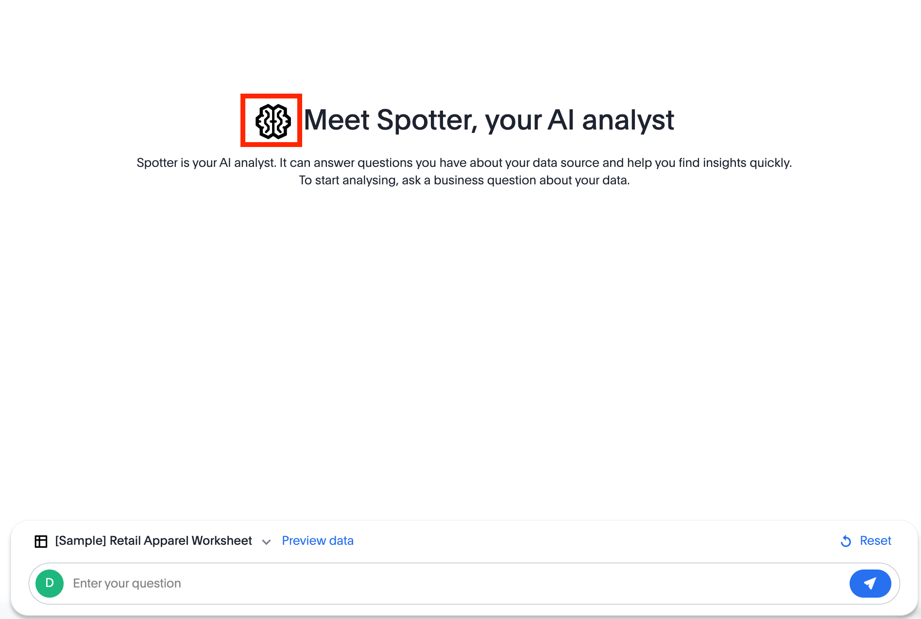
When you embed Spotter, you’ll notice that the embedded component loads an initial page with a prompt interface. The look and feel of this page vary depending on the Spotter version used for embedding.
Spotter Classic and Spotter 2 experiences🔗
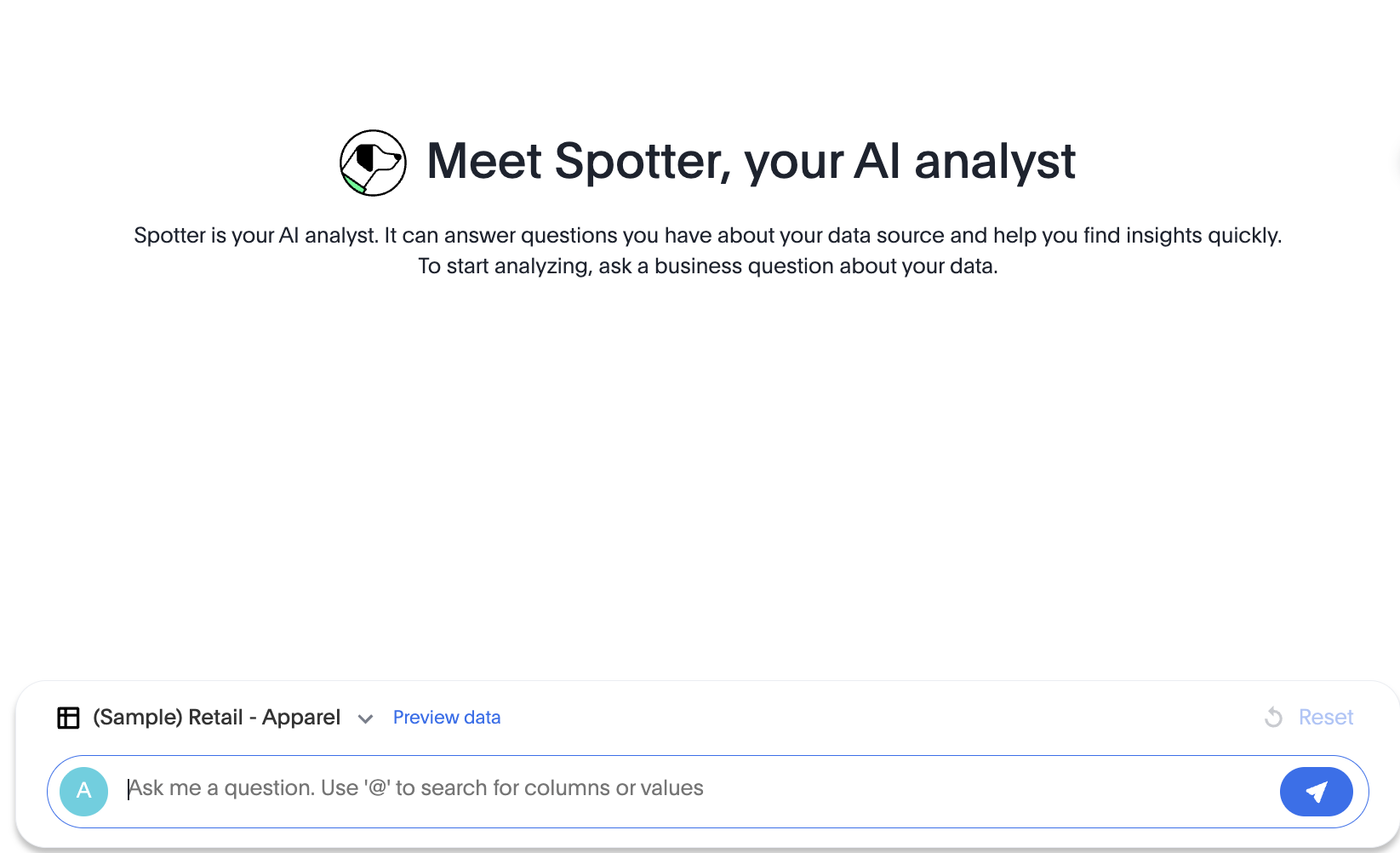
If you have embedded Spotter Classic or Spotter 2, the initial page includes a prompt bar for user input, a data source selector, and the UI options to preview data and reset a Spotter session.
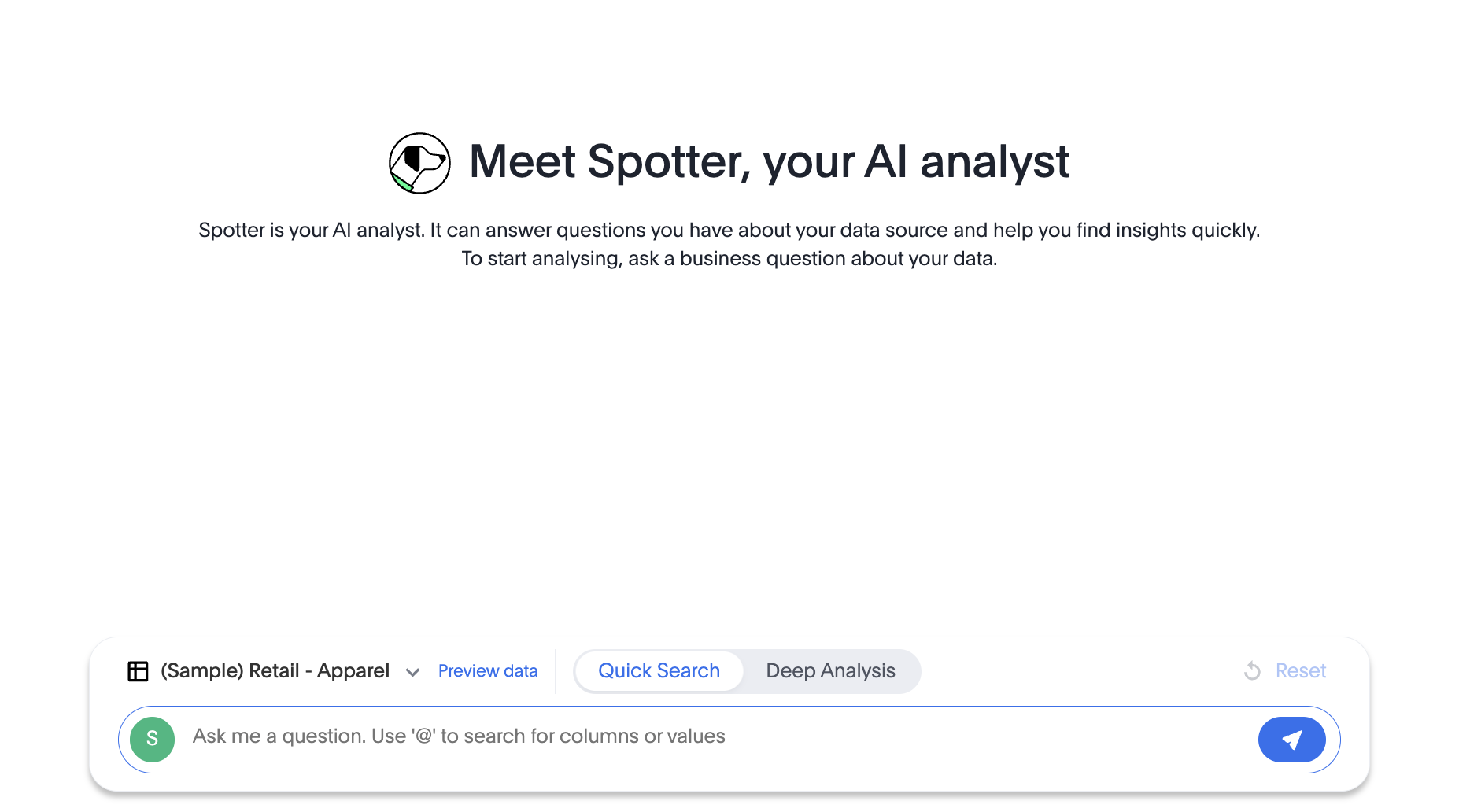
Spotter 3 experience🔗
In Spotter 3 embedding, you can load the page with a pre-selected data source or use the Auto mode to allow Spotter to automatically discover and select a relevant data model for user queries.
Default view:
With Auto mode enabled:
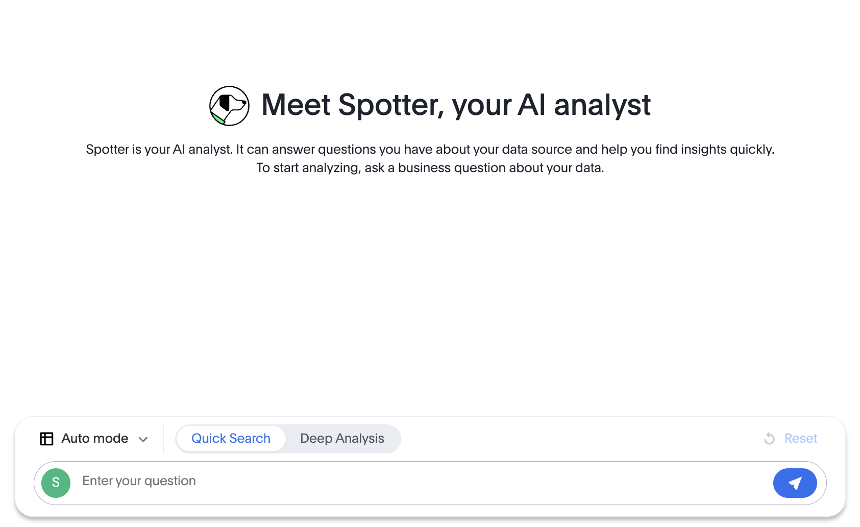
|
Note
|
When Auto mode is enabled, Preview data and Data Model instructions options will not be available. |
Optional settings for Spotter 3🔗
Spotter 3 experience is available with a new prompt interface that includes additional features and user elements to enrich your Spotter experience. You can include the Chat history panel to allow your users to access the chat history from their previous sessions.
To enable the new chat interface and chat history features, set the updatedSpotterChatPrompt and enablePastConversationsSidebar attributes to true, as shown in this example:
const spotterEmbed = new SpotterEmbed(document.getElementById('ts-embed'), {
    // ...other embed configuration attributes

    // Enable the updated Spotter chat prompt experience.
    updatedSpotterChatPrompt: true,

    // Enable the sidebar for accessing past Spotter conversations
    enablePastConversationsSidebar: true
});
The following figure shows UI elements and functions available in the new chat prompt and chat history panel:
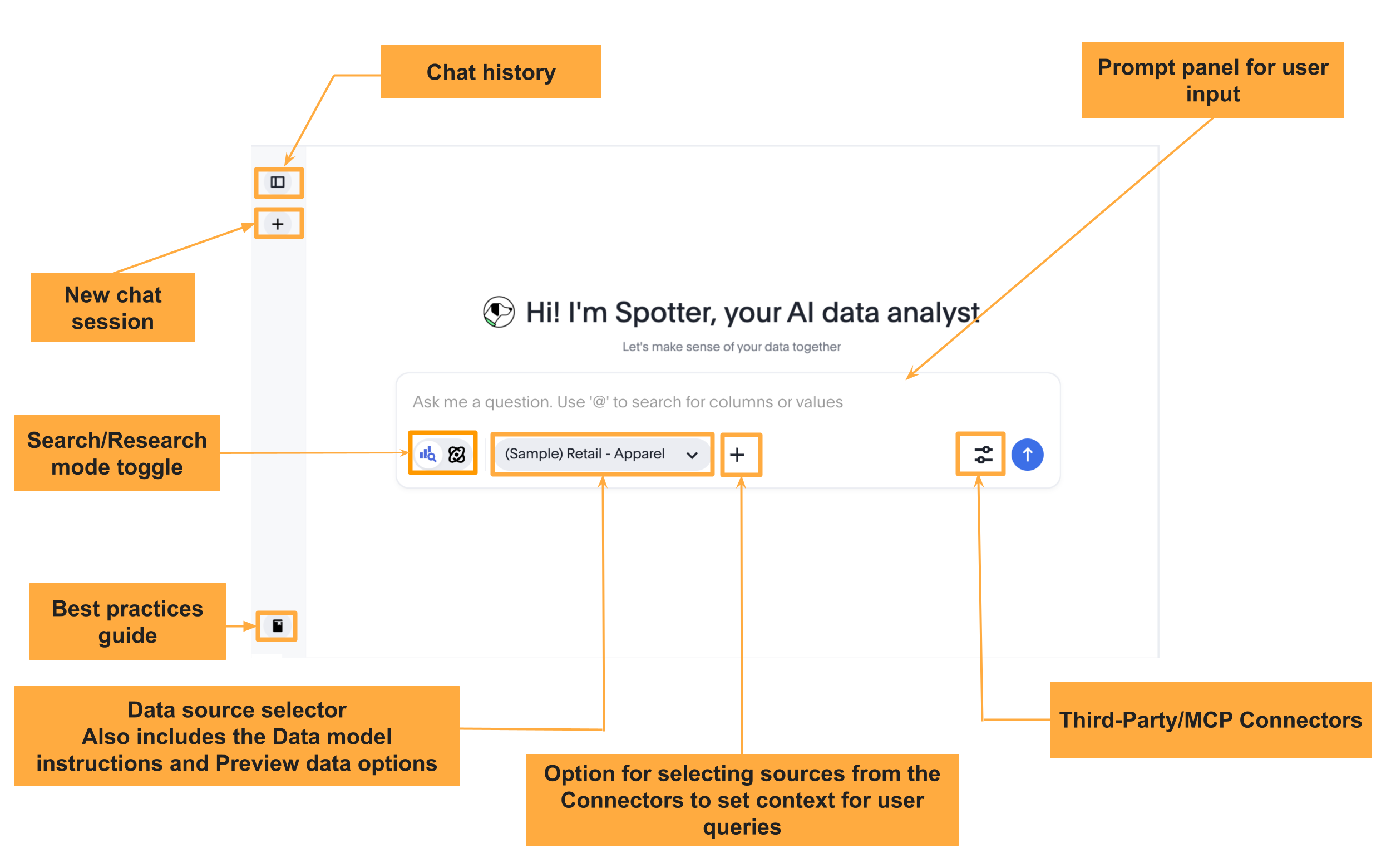
MCP connectors and resource selection icon🔗
A connector is an external MCP server or tool, such as Google Drive, Slack, Notion, Confluence, or Jira, which can be used as a data source in Spotter sessions. ThoughtSpot administrators can configure connectors to enable Spotter users to include both structured and unstructured data in their conversation sessions.
If the new prompt interface in Spotter 3 is enabled, the Spotter page displays the MCP Connectors menu along with a '+' icon in the prompt panel. Your application users can connect to a tool preconfigured by your ThoughtSpot administrator directly from the Spotter 3 prompt interface using the '+' icon and add resources to their conversation context.
|
Note
|
The MCP connector module and the '+' icon are displayed by default if the new prompt interface is enabled in your embed. However, we do not recommend using this feature in your production environments. |
Currently, the Visual Embed SDK does not provide any attributes or action IDs to hide these elements. As a workaround, you can use the CSS selectors to hide these elements:
init({
   thoughtSpotHost: 'https://your-thoughtspot-host', // URL of your ThoughtSpot instance
   authType: AuthType.None, // Authentication type; use appropriate AuthType for your environment
   customizations: {
    style: {
      customCSS: {
        rules_UNSTABLE: {
          // Hide the MCP connectors module in the Spotter prompt panel
          ".button-module__buttonWrapper.chat-connector-resources-module__addConnectorResourceButton": {
            "display": "none !important"
          },
          // Hide the add resources (+) icon in the Spotter prompt panel
          "button.button-module__button.button-module__buttonWithIcon.button-module__tertiary.button-module__sizeM.button-module__backgroundLight.button-module__both": {
            "display": "none !important"
          }
        }
      }
    }
  },
  // ...other configuration attributes
});
Customizing styles and interface elements🔗
The Visual Embed SDK provides a comprehensive style customization framework for overriding icons, text strings, and the appearance of UI elements.
The customizations object allows you to add custom CSS definitions, replace text strings, and override icons. If your customization framework uses external sources or hosting servers, ensure they are added to the CSP allowlist. For more information, see the CSS customization framework, Customize text strings, and Customize icons sections.
Customize using CSS variables🔗
You can customize the background color of the conversation and prompt panels, button elements, and the components of the charts generated by Spotter using CSS variables.
If Theme Builder is enabled on your ThoughtSpot instance, you can find the variables for Spotter customization by navigating to Develop > Customizations > Theme Builder in the ThoughtSpot UI and downloading the CSS variables.
// Initialize the SDK with CSS variables with custom style definitions
init({
  // ...
  customizations: {
    style: {
      // Use CSS variables to customize styles
      customCSS: {
        variables: {
          "--ts-var-button--primary-background": "#008000",
          "--ts-var-spotter-prompt-background": "#F0EBFF",
          "--ts-var-root-color": "#E3D9FC",
          "--ts-var-root-background": "#F7F5FF",
        },
      },
    },
  },
Customizing text strings🔗
To replace text strings, you can use the stringsIDs and strings properties in the content customization object.
The following example shows how to replace "Spotter" and other text strings on the Spotter interface.
// Initialize the SDK with custom text string replacements
init({
    // ...
    customizations: {
        content: {
            // Use the strings object to replace the visible UI text with custom labels.
            strings: {
                // Change all instances of "Preview data" to "Show data"
                "Preview data": "Show data",
                // Change all instances of "Spotter" to "dataAnalyzer"
                "Spotter": "dataAnalyzer",
            }
        }
    }
});
Customizing the Spotter icon🔗
To override an icon, you must find the ID of the icon, create an SVG file to replace this icon, and add the SVG hosting URL to your embed customization code. The most common icon to override is the default Spotter icon and its icon ID is rd-icon-spotter.
The following example uses the alternate-spotter-icon.svg file hosted on https://cdn.jsdelivr.net/ to override the Spotter icon.
 init({
     //...
     customizations: {
    // Specify the SVG hosting URL to override the icon, for example Spotter (`rd-icon-spotter`) icon
         iconSpriteUrl: "https://cdn.jsdelivr.net/gh/thoughtspot/custom-css-demo/alternate-spotter-icon.svg"
     }
 });
The following figures show the customized Spotter icon:
Hiding the Spotter icon and ThoughtSpot branding in the reasoning interface🔗
If you want to hide the Spotter icon from the prompt response page and reasoning interface, or if you want to remove ThoughtSpot branding, you can use the CSS rules with selectors, as shown in this example:
init({
   //... embed configuration attributes
   customizations: {
    style: {
      customCSS: {
        rules_UNSTABLE: {
          // Hide the Spotter icon in the tool call card under reasoning
          "svg.chat-module__spotterIcon.icon-module__iconStyle.icon-module__xxl.icon-module__white": {
            "display": "none !important"
          },
          // Control the visibility for the ThoughtSpot text in the tool call card under reasoning
          // Hide the element completely if MCP connectors are enabled, since the text-indent works for ThoughtSpot text only
          ".collapsible-item-response-module__title": {
            "text-indent": "-89px",
            "overflow": "hidden",
            "margin-left": "-24px"
          },
          // Hide the ThoughtSpot (or Connector) icon in the tool call card under reasoning
          ".collapsible-item-response-module__customIconWrapper": {
            "display": "none"
          },
        },
      },
    },
  }
});
Customizing menu actions and elements🔗
The SDK provides action IDs to disable, show, or hide the following elements and menu actions via disabledActions, visibleActions, or hiddenActions arrays.
For example, you can hide the Preview data, Reset in the prompt panel, or Pin, Download, and other actions from a Spotter-generated response.
The following code sample disables actions and menu elements using the disabledActions array:
 // Hide these actions
 hiddenActions: [Action.Pin,Action.ResetSpotterChat,Action.DeletePreviousPrompt],
 // Disable actions
 disabledActions:[Action.PreviewDataSpotter,Action.Edit],
 disabledActionReason: "Contact your administrator to enable this feature"
For a comprehensive list of supported actions, see Spotter menu actions.
Code samples🔗
Code sample for embedding Spotter Classic and Spotter 2 experience
import {
    SpotterEmbed,
    AuthType,
    init,
    EmbedEvent,
    HostEvent
} from '@thoughtspot/visual-embed-sdk';
// Initialize the ThoughtSpot Visual Embed SDK with your ThoughtSpot URL and authentication type.
init({
    thoughtSpotHost: 'https://your-thoughtspot-host', // Replace with your ThoughtSpot application URL
    authType: AuthType.None, // Use the appropriate AuthType for your setup
});

//Define event handler to show a loading indicator when the embed is initializing.
function showLoader() {
    // Show loading indicator
}

// Define event handler to hide the loading indicator when the embed has loaded.
function hideLoader() {
    // Hide loading indicator
}

// Find the container element in your HTML where the SpotterEmbed will be rendered.
const container = document.getElementById('ts-embed');
if (container) {
    // Create and configure the SpotterEmbed
    const spotterEmbed = new SpotterEmbed(container, {
        frameParams: {
            height: '100%', // Set the height of the embedded frame
            width: '100%', // Set the width of the embedded frame
        },
        worksheetId: 'your-worksheet-id', // ID of the data source object to query data from
        //... other configuration attributes
    });

    // Register event listeners
    spotterEmbed.on(EmbedEvent.Init, showLoader); // Show loader when initialization starts
    spotterEmbed.on(EmbedEvent.Load, hideLoader); // Hide loader when embed is fully loaded

    // Render the SpotterEmbed in the container.
    spotterEmbed.render();
    // Example: Add a host event to reset the Spotter conversation
    document.getElementById('resetBtn').addEventListener('click', () => {
        spotterEmbed.trigger(HostEvent.ResetSpotterConversation);
    });
}
Code sample for embedding Spotter 3 experience
import {
    SpotterEmbed,
    AuthType,
    init,
    EmbedEvent,
    HostEvent
} from '@thoughtspot/visual-embed-sdk';
// Initialize the ThoughtSpot Visual Embed SDK with your ThoughtSpot URL and authentication type.
init({
    thoughtSpotHost: 'https://your-thoughtspot-host', // Replace with your ThoughtSpot application URL
    authType: AuthType.None, // Use the appropriate AuthType for your setup
});

//Define event handler to show a loading indicator when the embed is initializing.
function showLoader() {
    // Show loading indicator
}

// Define event handler to hide the loading indicator when the embed has loaded.
function hideLoader() {
    // Hide loading indicator
}

// Find the container element in your HTML where the SpotterEmbed will be rendered.
const container = document.getElementById('ts-embed');
if (container) {
    // Create and configure the SpotterEmbed
    const spotterEmbed = new SpotterEmbed(container, {
        frameParams: {
            height: '100%', // Set the height of the embedded frame
            width: '100%', // Set the width of the embedded frame
        },
        worksheetId: 'your-worksheet-id', // ID of the data source object to query data from. For automatic model discovery and selection (Auto mode), specify '_spotter_data_source_discovery_id'
        updatedSpotterChatPrompt: true, // Enable new chat interface
        enablePastConversationsSidebar: true, // Enable chat history
        //... other configuration attributes
    });

    // Register event listeners
    spotterEmbed.on(EmbedEvent.Init, showLoader); // Show loader when initialization starts
    spotterEmbed.on(EmbedEvent.Load, hideLoader); // Hide loader when embed is fully loaded

    // Render the SpotterEmbed in the container.
    spotterEmbed.render();
    // Example: Add a host event to reset the Spotter conversation
    document.getElementById('resetBtn').addEventListener('click', () => {
        spotterEmbed.trigger(HostEvent.ResetSpotterConversation);
    });
}